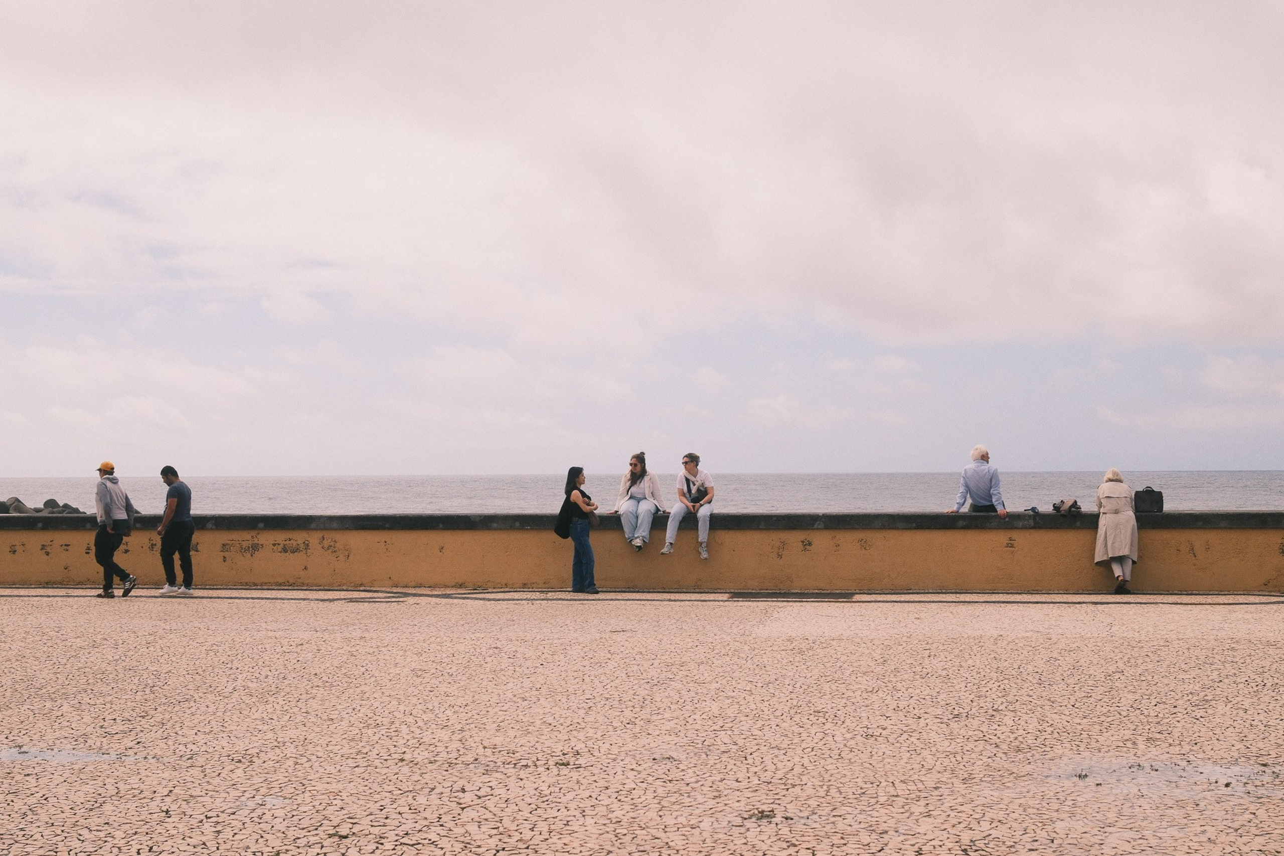
This Portra 400 Fujifilm recipe gives my X-Pro2 street photos a quieter colour palette, with warm brickwork, worn paint and darker shaded areas. This set moves from a cobbled alley to shop windows, doorways and a cathedral framed by leaves.
I like how the colours sit together here. The blue shop window does not take over the frame, and the green doors still have enough colour to feel part of the street. There is room for the light and the people to carry the photographs.
This is the Portra 400 recipe used for this set. It is a separate set of settings from Reggie’s Portra, which I have written about before. The name points towards a film-inspired look, rather than an exact reproduction of Kodak Portra 400.
The Portra 400 recipe settings
Here are the settings I have recorded for the Fujifilm X-Pro2:
- Film Simulation: Classic Chrome
- Dynamic Range: DR400
- Highlight: -1
- Shadow: +2
- Color: -2
- Sharpness: +1
- Grain Effect: Weak
- Noise Reduction: -3
- White Balance: Custom Daylight
- White Balance Shift: Red +2, Blue -5
- ISO: Auto, up to ISO 6400
- Exposure Compensation: +1 to +1 1/3
On the X-Pro2, DR400 requires ISO 800 or above. Keep that minimum in mind when setting up Auto ISO. The exposure-compensation range is a starting point, so check the brightest parts of the scene and reduce it when needed.
What I like about the colour
Classic Chrome and Color -2 give this version its restrained appearance. That suits the faded surfaces in these photos. The cream wall behind the bicycle, the blue shop window and the brickwork can sit in the same set without competing for attention.
The Red +2 / Blue -5 white-balance shift moves the colour towards warmth. You can see that warm feel in the sunlit walls, while the shaded areas still look cooler. The underlying white-balance choice also matters, so the shift should always be used with the intended base setting.
The shop-window photograph is a good example of what I want from this recipe. There is colour in the glass, but the person and the patch of light still give the frame its shape. It feels suited to everyday street photography.
It is still a recipe with deep shadows
A Portra-inspired name can suggest very soft tones, but this version uses Shadow +2. The alley and the silhouetted person show how much weight the darker areas can have. That is part of this recipe’s character.
Highlight -1 and DR400 give the brighter tones some help, but I would still watch my exposure when a pale wall catches direct sunlight. Adding +1 to +1 1/3 exposure compensation in every situation could lose detail. I would use the suggested range, check the result and adjust it for the scene.
Where I would use it
I would start with a town photo walk, looking for brickwork, painted doors, people crossing patches of light and quieter side streets. These photos give a better idea of that use than a description of colour alone.
I would test it separately for portraits or heavily lit interiors before treating it as an all-purpose setting. This set shows streets and buildings, so it is those subjects I can judge from the examples here.
Trying the recipe on your X-Pro2
Open IMAGE QUALITY SETTING > EDIT/SAVE CUSTOM SETTING and choose a bank. Enter the recipe values, save them and give the bank a clear name. Set Auto ISO and exposure compensation separately as needed, then check the white balance before you begin.
For me, this Portra 400 set works best when the light supplies the drama and the colour stays a little quieter. If that suits how you like to photograph streets, it is worth trying on a familiar route.
You can read my separate Reggie’s Portra article or browse the rest of my Fujifilm recipe collection for other settings and photo examples.

Provia Slide: A Fujifilm X-Pro2 Recipe for Colour and Everyday Details

Kodak Gold 200: A Warm Fujifilm Recipe for the X-Pro2

Solis: The Fujifilm Recipe I Used for a Week in Crete


Holiday Radeon